


Jeff Bezos once said, “Your brand is what people say about you when you're not in the room.” It’s a quote that gets to the heart of what branding really is: not your mission statement, not your tagline, but how people experience you when there’s no incentive to perform.
In the same way, you can tell a lot about what a company truly values by how it behaves when there’s nothing immediate to gain. That might show up in how it handles a customer service issue, the small delights baked into a product, or how it treats people who are just browsing but not necessarily buying.
On a website, this moment of truth often comes in the areas that aren't ripe for conversion optimization. One example? The 404 page.
Yes, that 404 page. It's that dead end you hit when a link breaks or a URL is mistyped. It’s not glamorous. It doesn’t convert. But it's an inevitable part of being on the web. And precisely because it’s not a “money page”, it can be one of the most honest reflections of what a brand actually values.
What Is a 404 Page and Why Do They Even Exist?
The 404 page is what a web server delivers when the user tries to access a URL that doesn’t exist. It’s an HTTP response code "404" that translates to "page not found". It typically means the page has been moved, deleted, or mistyped by the user. At any given point, anyone that has ever used the web has seen a 404 page.
In its default state, a 404 page is just a sterile error message. But most companies today have the option to fully customize it — to guide users back, soften the blow, inject a little humor, or turn a negative experience into a positive one. The question is though — do they bother?
404 Pages Are a Proxy for a Company’s True Values
The thing about 404 pages is that they have virtually zero directly attributable value from a revenue perspective. No conversion actions, no purchases, no newsletter or trial signups happen there. It is in many ways like the restroom at an office or a store. If the restroom is clean, with updated fixtures, perhaps some soft music in the background, and offers a changing station or an ADA-compliant stall, that says a lot relative to one that is dirty, dark, and always out of soap.
So when a brand takes the time to thoughtfully design its 404 page, it’s likely because it values something beyond the transaction. Maybe that’s user experience. Maybe it’s brand consistency. Maybe it’s just being helpful. But whatever the motivation, it shows that someone inside the company had to ask themselves “When things go wrong, how can we make that experience a little better?” and then actually put the effort into doing something about it.
In other words, a custom 404 page is a rare example of a company acting without the promise of any immediate return. And that’s where real values tend to show up.
Different Types of 404 Pages and What They Reveal
While every brand handles its 404 page differently, the ways in which they do so generally fall into a handful of categories. Some take the opportunity to help users find their way back, others use humor to soften the dead end, and a few go all-in on polished, branded experiences. These variations aren’t just stylistic — they reflect different priorities and philosophies. Let’s look at some of the most common types of 404 pages and what they quietly reveal about the companies behind them.
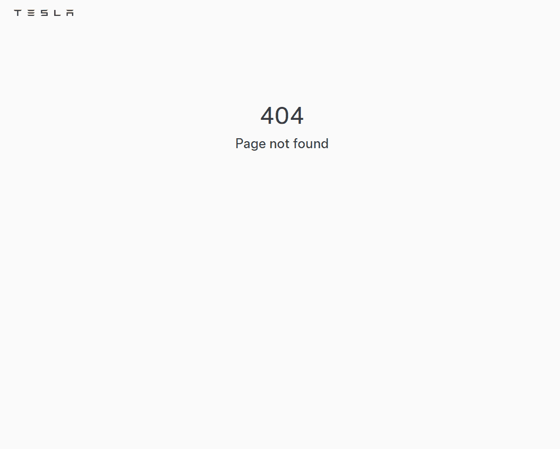
1. The Lazy 404
Just the words “404 Not Found.” No links. No help. No personality.
What it suggests: This company may be under-resourced or simply not value UX much at all. It could also reflect an organizational culture that’s more reactive rather than proactive.
Pretty much as default as it gets, the Tesla.com 404 page simply says "404 Page not found". Seems like a missed opportunity here to play with ideas like "low battery" and include some links to get back on track.
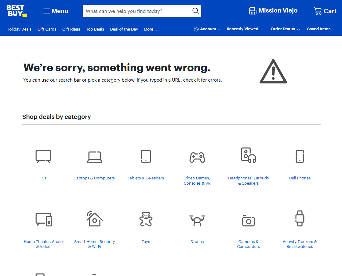
2. The Helpful 404
It offers a way out — a homepage link, a search bar, or maybe even a list of recommended pages.
What it suggests: The brand is user-centric, practical, and empathetic. They expect errors and want to make getting back on track seamless.
Not the flashiest or more personable experience but the BestBuy.com 404 page provides links to all of their product categories to get you back to shopping.
3. The Funny 404
Think memes, pop culture references, or an attempt at self-deprecating humor that makes you smile or smirk.
What it suggests: The brand has a playful voice, doesn’t take itself too seriously, and sees errors as another chance to connect.
A company long known for their use of humor in marketing, GoDaddy extends this practice to the GoDaddy.com 404 page declaring "Great goggly-woggly, you're in the wrong place".

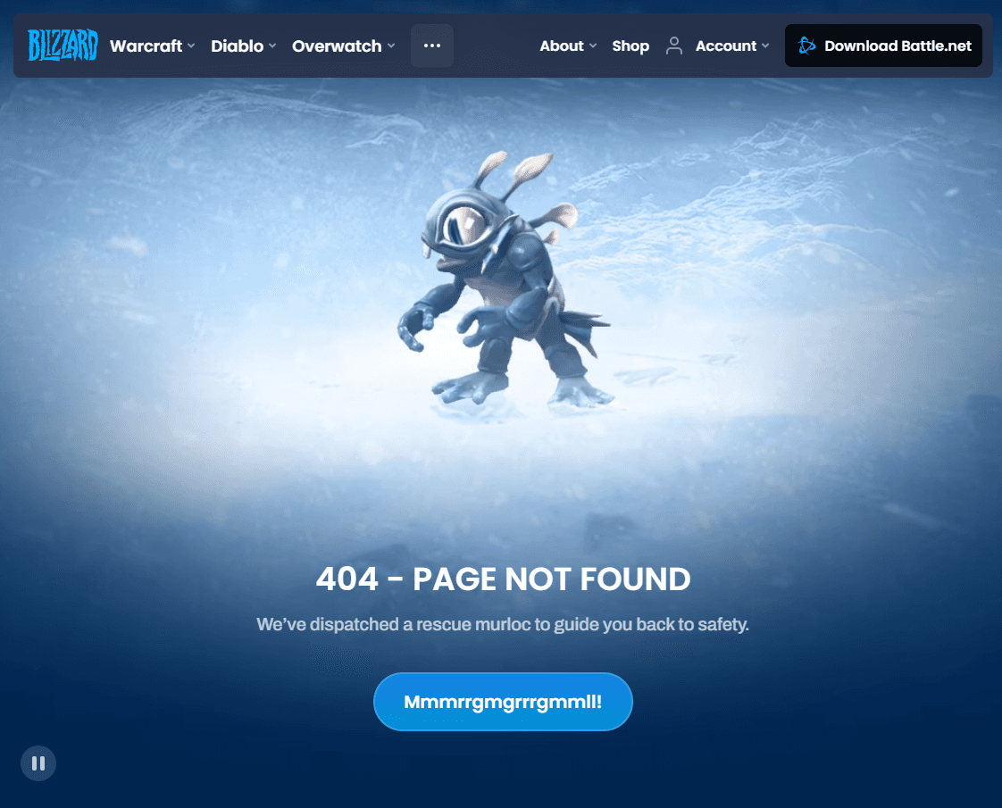
4. The Branded 404
It looks like every other page on the site: polished, on-brand, intentional.
What it suggests: Strong internal alignment, attention to detail, and a company that sees every touchpoint as part of the brand experience.
The Blizzard Entertainment 404 page includes one of their creatures (a "murloc") featured in their popular game Hearthstone.
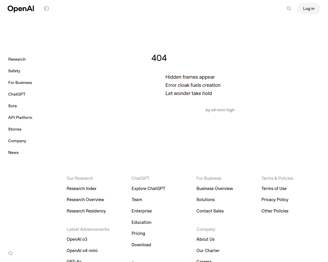
5. The Product-Oriented 404
It's one that puts their product front and center, perhaps subtly highlighting a primary value proposition.
What it suggests: A culture that runs product-first and takes pride in and perhaps dogfoods their own product. A 404 page that leads with product might be a strong indication of a brand that takes product experience seriously.
The OpenAI 404 page crafts a cute haiku that was written by o4-mini-high, one of their recent models.
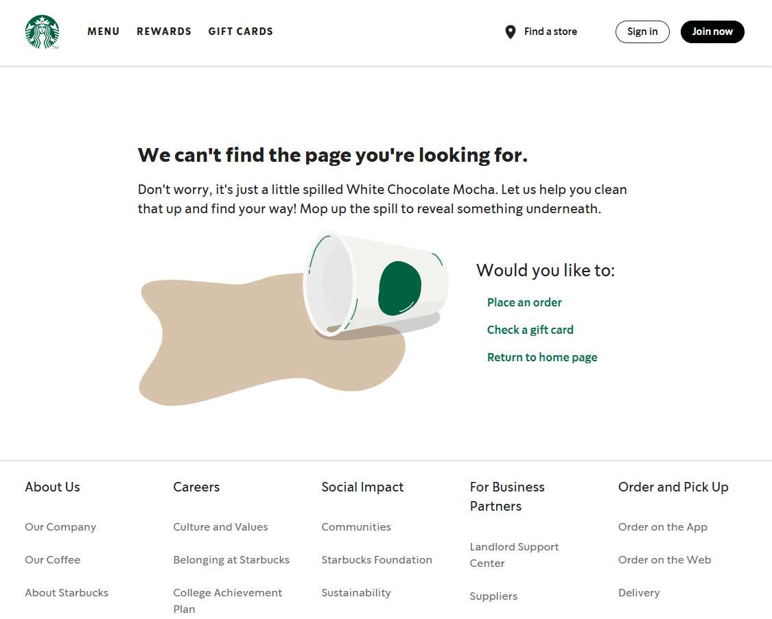
6. The Playful 404
These include interactive elements that allow you to engage with the 404 page in a fun, playful way.
What it suggests: A company that prioritizes customer experience and values direct interactions with their community of fans.
The Starbucks 404 page tells its users "…it's just a little spilled White Chocolate Mocha" and encourages the user to "mop up the spill" which reveals a surprise underneath.
Conclusion
Of course, a company’s 404 page isn’t a foolproof litmus test. A great one doesn’t automatically mean they treat customers well, and a bland one doesn’t guarantee the opposite. But when you look at it alongside other low-stakes, low-ROI parts of a company’s website, perhaps like their FAQ page, contact form, or even the unsubscribe flow, a pattern starts to emerge.
What brands care about, beyond the click, will almost always reveal itself in the quiet corners of the web experience.
© 2025 Designed and built by Keith Mura.